Introduction
Scrollbars are still one of the most difficult elements to customise nowadays using CSS. It is true that some browsers have pushed some experimental properties to make that possible, but the changes are neither standard nor stable yet, so frontend developers have to fight to integrate them into websites following the design specifications.
Trying to solve this issue, third parties have developed external libraries (most of them in JavaScript or other frameworks) to transform scrollbars into customizable HTML elements that make things easier. However, you can’t always freely integrate a third-party library in your project because it consumes resources and adds an extra dependency to maintain, especially when your control (or your company’s control) over the project is limited.
In this situation, frontend developers need to make an extra effort to come up with new solutions using pure CSS code as much as possible while trying to avoid adding extra costs.
This article demonstrates a pure CSS solution to position scrollbars outside a container using CSS container units without the need for JavaScript.
The problem
We worked in a project with another company for the same client. Most of the website had been already created by the other company and we joined during the last phases of the implementation.
The designs were fixed and approved so we couldn’t do so many proposals and we had to adapt our solutions to them. Additionally, we didn’t have any control to add external libraries either, so we felt we had our hands a bit tied. At the end, we could mainly add just CSS code. It was a bit disappointing, but we would try to do our best.
The most problematic component was a cart that was placed below the main navigation bar. This component was in fact a dialog that slid down after clicking on an icon in the navbar, showing then a list of products with a scrollbar. However, this dialog needed to have a very specific size according to the designs and several icons had to remain aligned in all cases.
I created an example on CodePen that mimics it: https://codepen.io/Isaac-pavon/pen/qEdZLVG
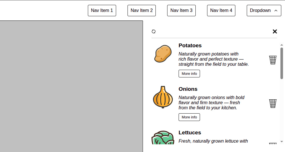
As you can see, the trash icons had to be aligned with the close button. Additionally, the scrollbar had to be placed not at the edge of the scrollable content, having consequently a gap to make it more user friendly (avoiding missclick on the trash icon instead of scrolling). Luckily, the design didn’t define the look and feel of the scrollbar, so we could leave the default look and feel from the browser. Finally, the cart container needed to have a surrounding padding of 30px.
At first sight this didn’t seem very complicated but actually it is for these reasons:
- Apart from the reasons explained above about the limited control that we had in the project, we couldn’t use external JavaScript libraries like Malihu-Scrollbar because the element was hidden by default. JS libraries have a lot of problems calculating the height of the elements if they are hidden. Additionally, the elements in the cart could be removed or added, therefore we needed to wait for the AJAX event to "reload" the scrollbar library. This was getting more and more difficult.
- The layout had to be the same for one or multiple elements in the cart, and the scrollbar should only appear when there was more than one element in the list.
- The scrollbar had to be placed outside of the scrollable element with a gap and, consequently, it had to be placed overlapping the padding of the container.
This turned out to be more challenging than initially expected.
Solutions in the past
Looking at what our frontend colleagues did in the past to solve this problem, the most common approach is to use a positive padding-right combined with a negative margin-right (and sometimes with box-sizing: content-box) inside the container to ensure the scrollbar is moved.

As you can see, the scrollbar is not placed at the edge of the scrollable element, there is a gap in cyan colour between the purple boxes and the scrollbar. This used to work fine when we knew that the scrollbar is going to be there always, but as I mentioned, the scrollbar should only appear when there is more than one item in the cart.
If we remove some elements and we leave only one…

The cyan gap is still there but there is something more, the element has grown because there is no scrollbar. Ugh, that’s odd because our design is very strict, we need that the icons at the right side were aligned.
Maybe if I use the same example that I provided above, we can see it more clearly.
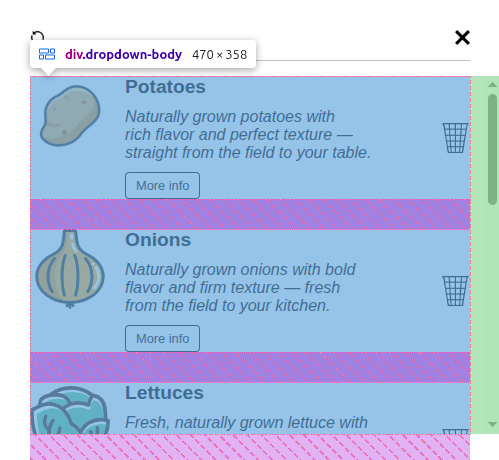
Therefore, we decided to place the scrollbar with a positive right padding and a negative right margin. It seems to work fine when we have multiple elements in the scrollable elements, the trash icon is aligned vertically with the ‘X’ close button, nice.
However, let’s remove some elements from the cart…
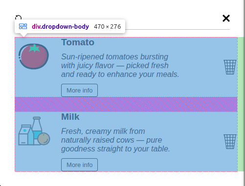
Unfortunately, the icons are no longer aligned, which is disappointing, since the approach seemed promising.
The nested elements try to use the maximum available size, but setting a max-width is not straightforward when the element’s width can vary because of the scrollbar. The scrollbar width is different depending on the browser and although the browsers are adding some custom properties to set a fixed width, they are experimental and are not working for all of them...
We need something more stable and reliable. And at this point is when container units come to the rescue.
Solution with css container units
CSS container units (cqw, cqh, cqi, cqb, cqmin, cqmax) appeared in browsers during 2023. They were started to be used natively as a standard in Chrome 110, Safari 16.4, Firefox 117.
Since then, they have been helping to the developers to achieve things that were quite complicated in the past, using ‘hacks’ or a combination of lots of properties to mimic the same results.
I love container queries and container units and I’m trying to apply them as much as I can. However, it is not always possible because some projects still need compatibility with Safari 15, and this is one of the weakest points of this solution. The good news is that the use of this version of Safari is expected to decline, and over time, this issue will naturally resolve itself.
But let’s focus on the solution.
Given the size of the container cart is fixed, we can define this element in CSS properly as a container with ‘container-type: inline-size;’ and ‘container-name: dropdown;’
.dropdown {
  display: flex;
  flex-direction: column;
  // Our dropdown is limited in size by the designs.
  width: 500px;
  // Total window height less navbar height.
  max-height: calc(100svh - 72px);
  padding: 30px;
  overflow: hidden;
  container-type: inline-size;
  container-name: dropdown;
}
Let’s now look at the scrollable element and let’s save some space at the right for our scrollbar.
.dropdown-body {
  display: flex;
  flex-direction: column;
  gap: 30px;
  // Adding the scrollbar if needed.
  overflow-y: auto;
  // Full container + 24px for the placing the scrollbar and an inner space and not be just at the edge. This would keep the space for the scrollbar independently if there is one item or more without missalignments.
  width: calc(100cqw + 24px);
}
As you can see, the scrollable element has the corresponding overflow-y property, but we have added a custom width that uses the complete width of the CSS container plus 24px to account for the browser’s default scrollbar. It is enough space for all the cases.
Now the scrollbar overflows the container and overlaps the external padding.
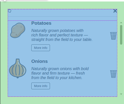
But we still have the same issue when removing elements and the remaining ones growing to use the space that the scrollbar leaves.
No problem, let’s define the maximum width of the child elements.
.dropdown-item {
  max-width: 100cqw;
}
Easy, we know now the container width, so, we can set that value as the maximum width for the child elements. Then they won’t use the extra 24px for the scrollbar.
Let’s remove some elements from the list and… Yay! It is working.
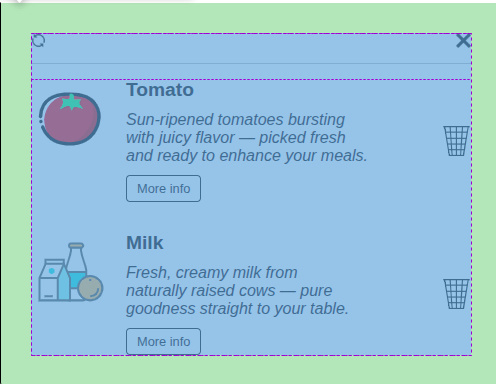
A pure CSS solution using just a few lines of code and not involving any JavaScript framework. It is reliable and it works with AJAX processes too, the user can add or remove any child element, and the scrollbar will update accordingly in a native way, using zero extra resources and it requires no maintenance.
You can check directly in the CodePen from above. Clicking on the trash bin icon, you can remove the nested element. If you click on the restore icon ‘⟳’, you can restore all the elements to their previous state.
Conclusions
Container units have emerged as robust and versatile tools that offer a fresh and reliable approach to addressing longstanding layout challenges in web design. Their ability to create more predictable and stable layouts makes them a valuable addition to modern CSS techniques.
Although our case study was quite specific, the technique of using container units demonstrates broad applicability and can serve as an effective alternative to negative margins in various contexts. Given the relative scarcity of coverage on this method in existing blog posts and resources, we believe sharing these insights adds valuable knowledge to the community.
One notable limitation is the lack of support in Safari 15, which affects the behaviour of container units. In such scenarios, we could apply:
.dropdown-body {
  display: flex;
  flex-direction: column;
  gap: 30px;
  // Adding the scrollbar if needed.
  overflow-y: auto;
  // Full container + 24px for the placing the scrollbar and an inner space and not be just at the edge. This would keep the space for the scrollbar independently if there is one item or more without missalignments.
  width: calc(100cqw + 24px);

  @supports not (width: 1cqw) {
      width: 100%;
      padding-right: 30px;
      margin-right: -20px;
      overflow-y: scroll;
   }
}
This could be a practical fallback to maintain consistent scrollbar presence, preventing layout shifts caused by fluctuating scrollbar visibility. Fortunately, this is a temporary issue expected to be resolved in future browser updates.
Looking forward, container units hold great promise for simplifying complex layout challenges and improving cross-browser consistency. Further exploration and adoption of this technique could encourage best practices and inspire new solutions across diverse web development projects.


