When I was younger, I studied trigonometry in Arithmetic and Physics classes in High School and at university. I immediately thought:“Whoa, such a cool thing!". But I wasn’t sure if I would find any real-life use for this in the future.
To my surprise, I was terribly wrong. It is true that we are not using trigonometry when you are driving or taking the garbage out, but, yes, in real life and at work, trigonometry is useful and needed.
Not so long ago, we were asked by our clients to make our sites look fancier and even more attractive to the users, and one of the solutions was to add more animations.
Hmm, cool, no problem at all but the clients normally don’t want simple animations that are used everywhere and are widely known. The challenge was to offer new and original types then, so I started to think of offering some wave effects.
It is true that this type of animation is not totally new, and there are plenty of examples using JavaScript, SVG paths or clip-paths to generate waves, but I wanted to go a step further and make things even more performant and maybe combine them to obtain new ones. Doing this only with CSS and SCSS will reduce the JavaScript workload; we won’t need external libraries (less dependencies), the page loads faster, better Google Lighthouse results are scored, and the images won’t need special preprocessing like SVGs, etc. There are several benefits about using non-JavaScript solutions.
And as an additional benefit, smooth animations often require mathematical functions, such as trigonometric ones, to achieve visually appealing effects, and that requires a lot of math operations that now can be done natively without extra JavaScript workload for the browser.
Thus, the idea was: “Why don’t we create wave animations without using JavaScript? Can we create, nowadays, a wave animation using only CSS and SCSS?”, and I thought, “why not?”. In the past, CSS has evolved quite a lot, and, consequently, SCSS, including new features and properties we could not have imagined before. So, it’s time to try it out.
Well then, the next question was, what do we need to achieve this?
Great, we’d need:
-
Trigonometric functions.
-
Container queries units.
-
A way to create automatic keyframes for the animation with the calculated position (x and y) for the element that follows the trigonometric function, using an SCSS loop.
Consequently, just for this example and trying to have something simpler, let’s take only sine functions. We can increase the scope later with other trigonometric functions.
1) Browser compatibility check
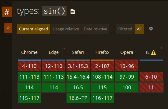
The first two requirements are not a problem; nowadays most modern browsers offer compatibility for those two features in their latest two major versions (except Safari, which requires at least version 16):
Anyways, now the main thing would be to create a piece of code with a loop in SCSS that could create different “states” or keyframes and determine where the element should be placed because unfortunately pure CSS can't do that yet.
2) Adding the basic structure and styles
Let’s start with a bit of HTML just for adding the elements in the page:
<div class="box">
  <span class="x-axis"></span>
  <span class="y-axis"></span>
  <span class="marker"></span>
  <canvas id="myCanvas"/>
</span>
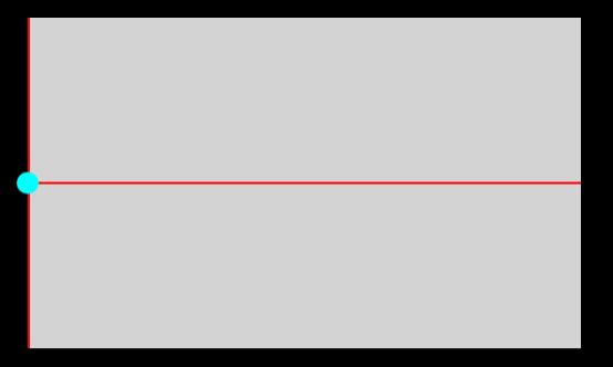
Good, we have now a box that has some items inside. Two spans to render the axes, a marker that would be the animatable element, and I added a canvas to render the path with JavaScript and confirm that the CSS / SCSS code is not wrong.
Then let’s continue with basic styles.
// Default styles.

body {
  display: flex;
  flex-direction: column;
  align-items: center;
  justify-content: center;
  padding: 0;
  margin: 0;
  min-height: 100vh;
  min-height: 100svh;
  color: white;
  background-color: black;
}

.box {
  position: relative;
  // This is a "must have" requisite to make the animation work.
  container-type: size;
  width: 500px;
  height: 300px;
  margin-top: 1rem;
  background-color: #D3D3D3;
}

.x-axis {
  position: absolute;
  top: 50%;
  left: 0;
  z-index: 2;
  width: 100%;
  height: 2px;
  background-color: red;
  transform: translate(0, -50%);
}

.y-axis {
  position: absolute;
  top: 0;
  left: 0;
  z-index: 2;
  width: 2px;
  height: 100%;
  background-color: red;
}

.marker {
  position: absolute;
  top: calc(50% - 10px);
  left: -10px;
  z-index: 3;
  display: block;
  width: 20px;
  height: 20px;
  border-radius: 50%;
  background-color: cyan;
}

canvas {
  position: absolute;
  width: 100%;
  height: 100%;
  z-index: 1;
}
Let’s see the results:

Hmm, not very impressive for the moment. Let’s add the JavaScript code to add a background path used as a guide.
3) Adding a JavaScript sine path as guideline
// Get the canvas element and its context
const canvas = document.getElementById('myCanvas');
const marker = document.getElementsByClassName('marker')[0];


// Check if canvas and marker exist.
if (canvas && marker) {
  const ctx = canvas.getContext('2d');

  // Get the CSS variable value of the previous sibling
  const computedStyles = getComputedStyle(marker);
  const cssVariableValue = parseFloat(computedStyles.getPropertyValue('--frequency'));

  // Set the canvas width and height
  canvas.width = canvas.offsetWidth;
  canvas.height = canvas.offsetHeight;

  // Calculate the frequency based on canvas size
  const frequency = (2 * Math.PI) / canvas.width * cssVariableValue;

  // Define the properties for drawing the sine function
  const amplitude = canvas.height / 2;  // Set the amplitude of the sine wave
  const phaseShift = 0;  // Set the phase shift of the sine wave
  const yOffset = canvas.height / 2;  // Set the y offset for centering the sine wave

  // Clear the canvas
  ctx.clearRect(0, 0, canvas.width, canvas.height);

  // Start drawing the sine wave
  ctx.beginPath();
  ctx.moveTo(0, yOffset);

  // Calculate and draw the points of the sine wave
  for (let x = 0; x < canvas.width; x++) {
    const y = (-1) * amplitude * Math.sin(frequency * x + phaseShift) + yOffset;
    ctx.lineTo(x, y);
  }

  // Set the line color and width
  ctx.strokeStyle = 'blue';
  ctx.lineWidth = 2;

  // Set the line style to dashed
  ctx.setLineDash([5, 3]); // The first number represents the length of the dash, and the second number represents the length of the gap

  // Draw the sine wave with the dashed line style
  ctx.stroke();
}
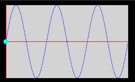
And now we have:

Ahhhh! Much better!
4) Getting our hands dirty: creating a mixin for the animation
Given that we have now the basics, let’s start to add some animation properties to the marker.
.marker {
  position: absolute;
  top: calc(50% - 10px);
  left: -10px;
  z-index: 3;
  display: block;
  width: 20px;
  height: 20px;
  border-radius: 50%;
  background-color: cyan;
  animation-name: sine;
  animation-duration: 5s;
  animation-timing-function: linear;
  animation-iteration-count: infinite;
}
Perfect, we will name our animation as “sine”, make it go linear, last five seconds and play in a loop.
Cool, this is taking some shape. Next, we would need to create something that generates the keyframes of the animation. It would be great if this could be done automatically instead of having to manually calculate the position of the marker during the animation period.
At this point, I think the best and easiest way to do it could be to create an SCSS mixin to parse some values and generate the code that would be embedded inside the “.marker” class. That way we can improve the reusability of the code and add some customizations, depending on the scenario.
@mixin keyframes($animation-name) {
};
Hmm, but what kind of values should we parse? Oh no! What a dilemma!
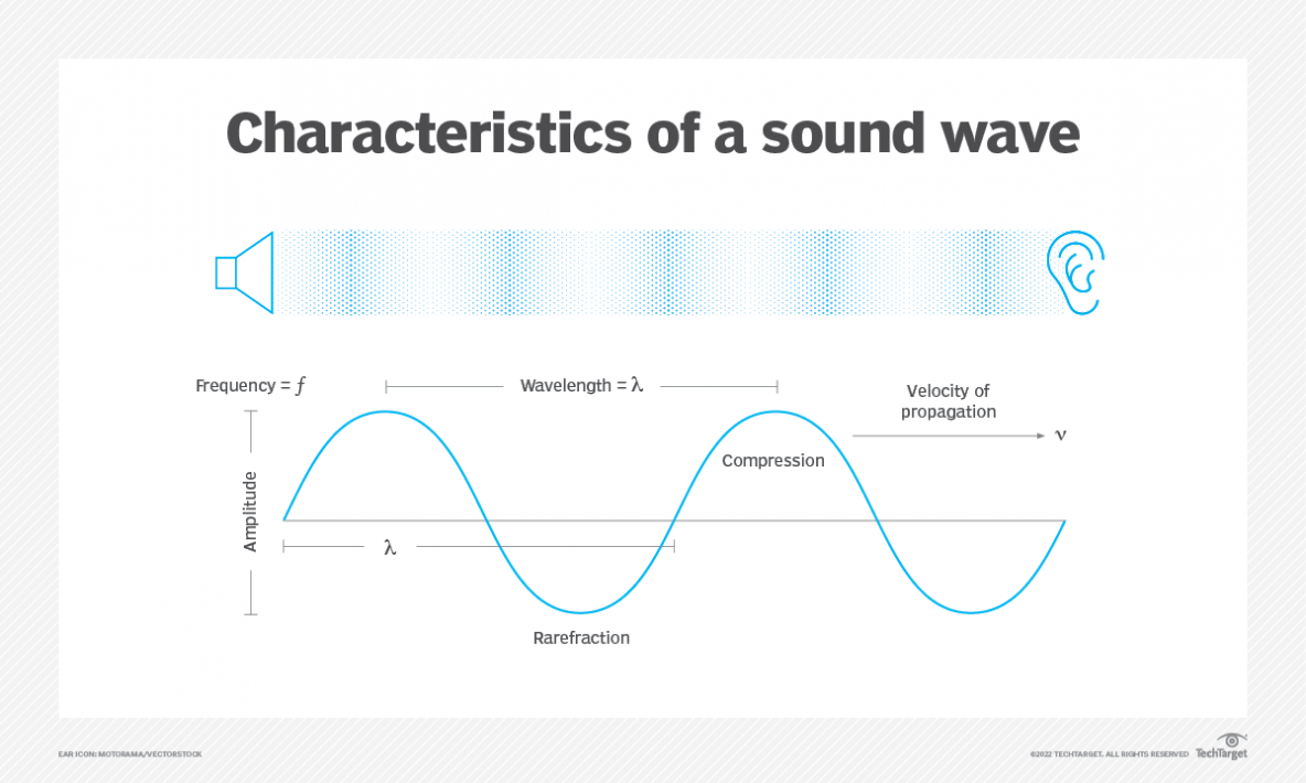
While I was looking at the image and the sine function, I just remembered my Physics classes about how particles move in a wave (yes! when you need to calculate the frequency in Hz of some particles or sound waves):
So, I need to define a wavelength and an amplitude, then. Great, Physics were the answer!
Now that we figured out how to do it, let’s define the amplitude as 100% of the container. Given that we would work with a "transform" property which does not allow the use of percentages (because they are relative to the size of the element itself instead of the container—in this case, the marker, not the box), we need to use container units. So, the wave would have a wavelength of 100cqw and 100cqh for the complete amplitude (50cqh for each half). At some point, we would need to define the frequency to know how many wavelengths should be rendered inside the container or vice versa.
However, now the problem is how to generate enough keyframes to avoid lagged animations and make them the smoothest possible, so let’s define a variable named “segments”. Comparatively, those segments would be like taking an N number of photographs during a movement. Just like having 30 or 60 frames per second, the higher the number, the smoother the movement, but less performant. Therefore, let’s take a value between those values as default.
@keyframes #{$animation-name} {
    @for $i from 0 through $segments {
      $key-frame: ($i / $segments * 100) + '%';
      #{$key-frame} {
        // transform property would go here.
      }
    }
  }
Now we have an SCSS loop that indeed automatically generates the keyframes. We have also the index value that can be used to calculate where the particle / marker should be, according to the sine formula.
Time to calculate the positions, then! The X axis would be determined by the container width, the number of segments and the current keyframe (index), so, it could be something like this:
X = container width * index / number of segments
Now we can know the distance traveled by the marker for each loop iteration of a total of segments. For example, if the container has 500px and we have 5 segments, then in each iteration the marker will travel 100px.
However, the Y axis would be more difficult to calculate. We need to consider the amplitude, the sine function, the frequency and the number of segments and invert the results to start the graph on the positive part of the Y axis.
Y = amplitude / 2 * sin(360deg * frequency / segments) * (-1)
Oof. It is a bit abstract, I know. It works like the Y axis, we have an initial distance (amplitude) that we need to divide by 2 to calculate each part of the graph (positive and negative) and then following the same loop logic, calculate the ratio of each iteration regarding the maximum number of segments. It's important to consider that the sine function works with degrees, being the maximum value 360º. So, it is required to multiply it by the ratio of the iteration progress to convert the final value in degrees. In other words, divide 360 by the number of segments and multiply it by the iteration index. As a last step, inverting the result so it starts in the positive area of the Y axis.
Additionally, we face another problem: the results are misplaced because we didn’t consider the width and the height of the marker, and we would need to center it.
X = (container width – 100%) * index / number of segments
Y = (amplitude / 2 – 50%) * sin(360º * frequency / segments) * (-1)
Whoa, that sounds quite complex, but indeed it works. Hence, the code-parsing variables and parameters would be something like this:
// Wave keyframe generator based on sin().
@mixin keyframes($animation-name, $type: "", $segments: "", $length: "", $amplitude: "", $frequency: "") {
  will-change: transform;
  transform-style: preserve-3d;
  backface-visibility: hidden;

  // Exterior by default.
  $element-width: 0%;
  $element-height: 0%;

  @if $type == "interior" {
    $element-width: 100%;
    $element-height: 50%;
  }

  @if $segments == "" {
    $segments: 1;
  }

  @if $length == "" {
    $length: 100cqw;
  }

  @if $amplitude == "" {
    $amplitude: 50cqh;
  }

  @if $frequency == "" {
    $frequency: 1;
  }

  --frequency: #{$frequency};

  // Consider that the length and amplitude is reduced by the current element size.
  @keyframes #{$animation-name} {
    @for $i from 0 through $segments {
      $key-frame: ($i / $segments * 100) + '%';
      #{$key-frame} {
        transform: translate3d(calc((#{$length} - #{$element-width}) * #{$i} / #{$segments}), calc((#{$amplitude} - #{$element-height}) * (-1) * sin(#{$i} * (360deg * #{$frequency} / #{$segments}))), 0);
      }
    }
  }
}
Actually, I’ve added some properties like "will-change" and "transform-style" to improve the performance a little bit. "translate3d" will also force the 3D rendering of the browser to make it work better.
Besides, we must call the mixin inside the class.
@include keyframes('sine', 'exterior', 60, '', '', 3);
In fact, I’ve added an extra "if" statement for “interior” or “exterior” just in case we want to consider the width and the height of the marker in the calculations.
Yay! Finally, it is working!
You can see the results in this Codepen.
Since we know that we can create automatic keyframes for animations and apply the exact coordinates, we can modify the frequency in the mixin and the graph will change automatically too.
5) Conclusions and next steps proposals
The use of trigonometric functions in CSS and SCSS opens up exciting possibilities for creating dynamic and visually appealing animations without relying on JavaScript. By harnessing the power of sine, cosine, and tangent functions, we can generate smooth wave-like movements, simulate natural phenomena, and bring life to our web designs.
The example demonstrated in this article showcases the potential of using CSS and SCSS to create wave animations. By leveraging the power of trigonometry and combining it with the flexibility of CSS, we were able to achieve animations that are performant, lightweight, and easily customizable.
Thus, the future prospects for CSS trigonometric functions and animations are promising. Here are a few potential directions for further exploration:
- Expansion to other trigonometric functions: While the example focused on the sine function, the same principles can be applied to cosine and tangent functions. By incorporating these additional trigonometric functions, we can create even more diverse and complex animations.
- Advanced animation techniques: With CSS and SCSS constantly evolving, we can expect the introduction of new animation properties and features that enhance the capabilities of trigonometry-based animations. This may include built-in functions for handling animations based on trigonometric curves or easing functions.
- Integration with CSS variables: CSS variables offer a powerful way to define and manipulate reusable values. By integrating CSS variables with trigonometric animations, we can achieve greater control and customization over the animations, allowing for dynamic adjustments based on user interactions or other factors.
- Performance optimization: As browser technologies continue to improve, we can anticipate better optimization and rendering of CSS animations. This will result in smoother and more efficient trigonometric animations, enabling more complex and realistic effects with minimal impact on performance.
- Exploration of 3D transformations: Trigonometry plays a crucial role in 3D transformations, such as rotations and perspectives. By combining CSS trigonometric functions with 3D transformations, we can create immersive and interactive animations that provide a rich user experience.
In summary, CSS trigonometric functions and animations offer a world of creative possibilities for web designers and developers. By leveraging the power of trigonometry within CSS and SCSS, we can bring dynamic and engaging animations to life while benefiting from the performance advantages and reduced dependencies that CSS-based solutions provide. As the field of CSS continues to evolve, we can look forward to even more exciting developments in this area.


